CREATE THE PLANNED INTERACTIVE PRODUCT and CREATE A GRAPHICAL USER INTERFACE COMBINING MEDIA ELEMENTS WITH USER INTERACTIVITY
Resources and References for images
|
|
00:00 - At this point in time, I am opening the app from the device home screen. You can see my App icon and loading screen for the app. This shows you how long the loading time of the app is. You can clearly see that it is quite quick, this is because all of the images are optimised so they don't take up much storage and the app is quick to load.
00:02 - At this time, you can see me using the home screen. You can clearly see the text on the page and the background is correctly optimised for the device screen size. You can also see the interactive menu at the bottom, this shows all of the different pages which are available in my app. This also shows that functionality works to a high standard and the app is easy to use for my target audience. This also shows the load times for the pages as I go to the next page by clicking on the menu at the bottom. This also shows how the user interaction is (very easy), which is what the client wants.
00:06 - At this time, I go to the next page, this page is the map page. This page has a background, text and a map (Interactive Feature). The background is clearly optimised for the phone screen size at it perfectly fits on the page. It is also optimised because the loading time for this page is really quick. The map is at the bottom of the screen, this takes a bit longer than the other features on the page to load but it is still very quick. Within the map I included a few different features, the map is already right on Cambridge, so you don't have to zoom in manually. There is also a pin which I created, this states - "Cambridge, Let your journey begin here:", this makes it clear where Cambridge is and where you should be.
00:17 - This is where I go to the next page, this is the information page within my app. On this page I have a Background, text and a video. The background is clearly optimised for the phone screen size at it perfectly fits on the page. It is also optimised because the loading time for this page is really quick. Also the video is embedded from YouTube, this means it is quick to load and it is optimised for the app. You can also view the video in full screen which makes the user experience much better. Also, you can see me scroll through the text which is another form of user interaction.
00:40 - This is the page where it covers the Grand Arcade, this is one of the main shopping centres within Cambridge. In this section I have Text, Images and a background. The background is clearly optimised for the phone screen size at it perfectly fits on the page. It is also optimised because the loading time for this page is really quick. The images used are also very optimised as they fit perfectly on the app and the loading times aren't compromised.
00:43 - This is where I go to the next page, the page I go to is the visits page. For this I had to go into a separate menu which helped me to have more icons as they couldn't fit on the menu at the bottom. On this page I had text, images and a background. The background is clearly optimised for the phone screen size at it perfectly fits on the page. It is also optimised because the loading time for this page is really quick. The text also features a scroll, this is another form on user interaction which is what the client asked for.
00:50 - This is where I go to the quiz page, this has many different features, but none of them limit the loading time for the page as they are optimised. The different features are, background and the quiz itself. The background is clearly optimised for the phone screen size at it perfectly fits on the page. It is also optimised because the loading time for this page is really quick. Also, the quiz is clearly optimised as the loading time is quick, also you can see that the app works as I use it.
0:00 - Here you see my Xcode Storyboard where I have made my app. The storybaord shows all 6 of my pages which all have buttons, interactive features, images and text on them. The view controllers of each page are linked together but the view controller in the centre is where all of the menu features are added to the application.
0:20 - At this time, you can see my home page of my app, this sums up Cambridge but it has no interactive features.
0:46 - At this time, you can see my page on the Grand Arcade, this sums up information about the shopping centre with text and images. The text is scrollable and you can see this in the code.
1:20- At this time, you can see my Visits page, this is a page which talks about all the things you can do in Cambridge, it is summed up with text and images and the text is scrollable.
1:41 - At this time, you can see my information page, this consist of text and a video. You can see the coding in this section which tells you how I got the video to be embedded into the application.
2:06 - At this time, you can see my quiz section. This page consists of coded buttons and labels. The coding for this section is very extensive and there is a lot of it. But you can see how I created this.
2:52 - At this time, you can see my Map page. This consists of text and the map. In this section you can see the coding on how I embedded the map and how I created a pin within the map. Also it shows how I formatted the text to fit on the app page.
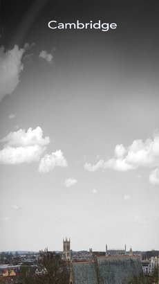
App Background:
I have made the image the resolution of 1080 x 1920, this is because this is the screen resolution size of the iPhone 7, which is my chosen model for the creation of my app. The images contain locations around Cambridge, this is because my app is about Cambridge and will appeal to my audience.
Backgrounds:

|
|

|
DEMONSTRATE OPTIMISATION TECHNIQUES ACROSS THE INTERACTIVE MEDIA PRODUCT
00:00 - Duplicating Layer
00:14 - Scaling layer
00:42 - Saving image for Web use
00:49 - Image file type
00:53 - Image Colour type
01:15 - Exporting Image
02:00 - Importing image to Xcode
02:10 - Setting Home Screen Background
00:14 - Scaling layer
00:42 - Saving image for Web use
00:49 - Image file type
00:53 - Image Colour type
01:15 - Exporting Image
02:00 - Importing image to Xcode
02:10 - Setting Home Screen Background
